


Colors for Art: How to Find the Colors that Go Together
 Story by:
Jimmy Bell
Story by:
Jimmy Bell
Choosing colors is a tough task for any artist, but it’s one of the most important decisions to make when painting or drawing. Before you get started, take some time to think about what emotion you want your piece to evoke and which colors will best fit that mood. You can also consider what color scheme matches your personal style the best!
Once you’ve considered these questions and chosen an idea for your project, there are three main ways to find out which colors go together well: trial-and-error, color wheel theory, and complementary contrasts. Which method suits your needs? Read on!
Ways to find out the right color for your needs:
- Choosing colors with trial and error: The best way to determine which colors go well together is by testing them out! Whenever you’re painting or drawing, set aside a piece of paper without any color on it and start experimenting. Mix some different paint swatches until you find the right tone that works for your project.
Eventually, you’ll be able to match this shade with other complementary shades as needed. How will you know if they work? It’s all about what feels good when applied onto the surface!
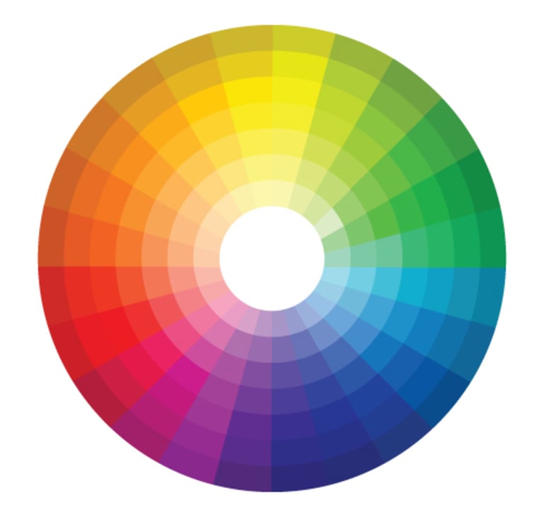
- Color wheel theory: The rainbow is made up of a spectrum or ‘wheel’ of colors. The three main sections are red, orange, and yellow; blue, indigo, and purple; green, cyan, and pink/magenta. Mixing two opposites from these categories creates the secondary colors- so mixing red and yellow will create an orange hue!
Similarly, you can try mixing the colors on each side of the wheel. If a color is placed next to its opposite, that means it will create a complementary contrast- so blue and orange are complementary because they’re opposites.
- Finding complementary contrasts: You can find complementary pairs by finding one side’s dominant color on the other side of the wheel (e.g., if your piece has many blues in it, then look for any corresponding shades on the opposite end). Once you’ve found them, think about which colors would best represent the feelings or emotions you want your piece to evoke.
The benefit of contrasting color schemes is that they create a visual contrast- which can make your painting more appealing to look at. How do I know if my piece has enough contrast? For one, you’ll want it to have plenty of difference between lighter and darker shades to show the transition.
Things to consider when choosing colors:
- How do the colors make you feel? Every color is meant to invoke a certain mood, and it’s important to consider what feeling you want your piece to evoke before choosing colors. You may have seen brands choosing colors based on color psychology. For example, royal blue is often associated with superiority, while red is seen as energetic and passionate. Once you’ve decided on an emotion that fits best for your project, use the color wheel to find complementary pairs of hues that will help create this feeling through complementary contrast!
- What is the color scheme of my work? If your work is usually black with a hint of white, then it’s important to consider what color will fit that mood. It may be helpful to think about which colors are the most prominent in your previous works and choose ones that harmonize well with those!
- Find your style: Think about how you want people to see your art when choosing a palette because they can represent aspects of who you are, like personality traits, hobbies, interests. How do you want your viewers to see the subject of your painting or drawing?
- Do you need lots of variety? It can seem daunting when there are so many different shades between two complementary colors, but this doesn’t have to be an issue! The more extreme and varied the range of tones between them will make them more complementary.
- Find inspiration from other artists: It’s always good to get inspiration from other artists and see what colors they use in their work. How do you want your art piece to look? What mood are you going for, and which colors suit that best? Many people follow this step as they get to see real results from various color schemes and what they can create with them.
- Look for the available space: Consider how much space you have available and what kind of mood you want to create when choosing your color scheme. How much space do you have to work with? What colors would complement that area well or create the mood you’re going for? Having all these things clear in your mind before choosing a color palette will make it much easier to create.
Common color combinations that many artists use:
You may feel that artists create their own color combinations, but most of the time, these combinations are picked as inspiration from what’s available. How you choose to combine these colors is the main factor of your painting or drawing style, so don’t feel pressured into using a color combination that doesn’t suit your personal preference and the project at hand!
- Yellow + Purple: Yellow is often associated with joy, happiness, and energy. It brings a sense of warmth that’s perfect for sunny days or rooms where you want to feel energized! On the other hand, Purple has a cool tone, but its vibrancy makes up for it by adding liveliness in an otherwise dark room. This color combination can also be used as an inspiration when depicting certain emotions such as disappointment or sorrow.
- Pink + Orange: These colors are two opposites on the spectrum which means they create balance together. The brightness of pink offers contrasts from the earthy orange hue while still creating harmony between these two opposite hues.
- Brown + Blue: This color combination is often used in calming scenes. It brings a sense of stability and serenity, which is perfect for bedrooms or living rooms that you want to feel relaxed!
- Beige + White: This color combination is great for a fresh, clean look. The beige offers warmth while the white brightens and cleans up space as it creates an open, airy feeling that can also make your room or piece seem larger than life!
- Purple + Red: Purple on its own has been known to have a cool tone, but this hue’s vibrancy makes up for it by adding liveliness in an otherwise dark room. This color combination can also be used as inspiration when depicting certain emotions such as disappointment or sorrow. How about creating a strong contrast between purple and red? It will create dynamic energy which may suit scenes of action!
- Green + Yellow: These two colors complement each other nicely since both are warm hues with high saturation levels. Yellow creates a refreshing feel, while green gives a sense of stability. How about adding some blue to this combo? It can create an energizing and fresh atmosphere that is perfect for scenes involving lightheartedness or playfulness!
Conclusion: Choosing colors for your art can be tough, but it’s one of the most important decisions you make when painting or drawing! We hope this article helps you make your decisions easier!
Image Source: BigStockPhoto.com (Licensed)


Share options
Share a link that only Beer Connoisseur subscribers can access